

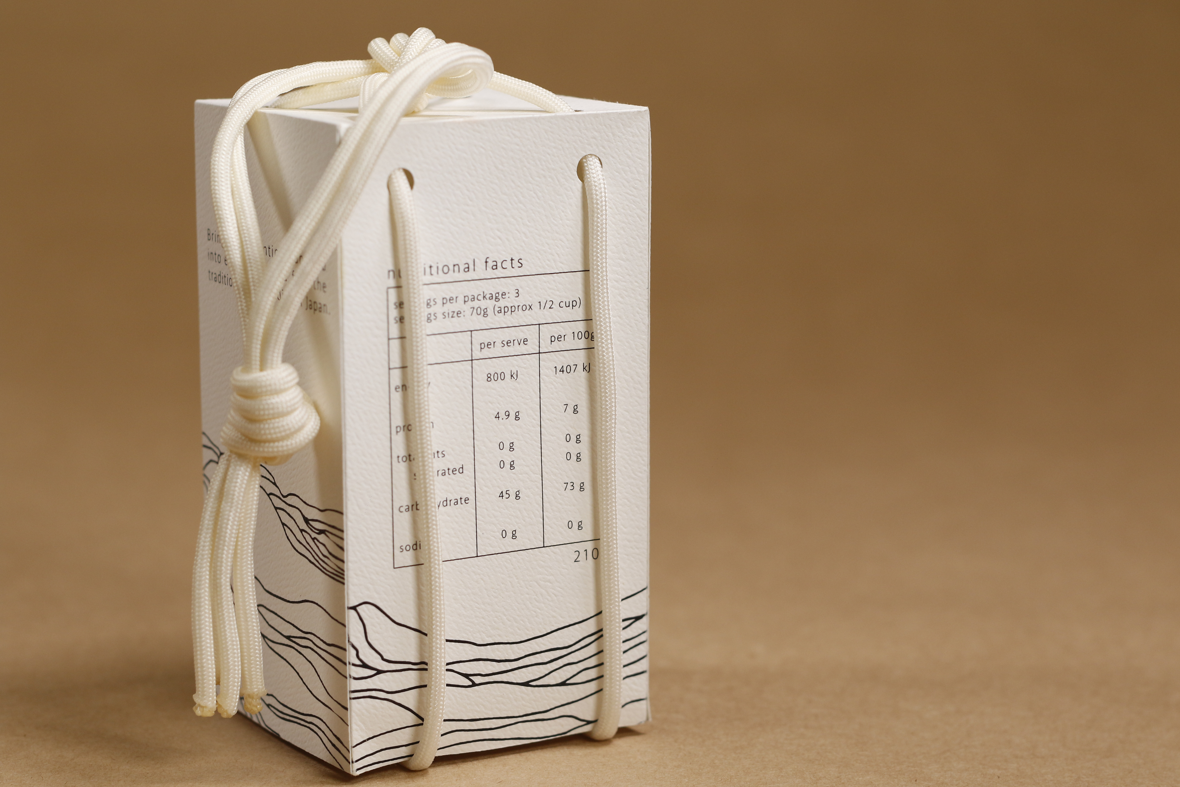
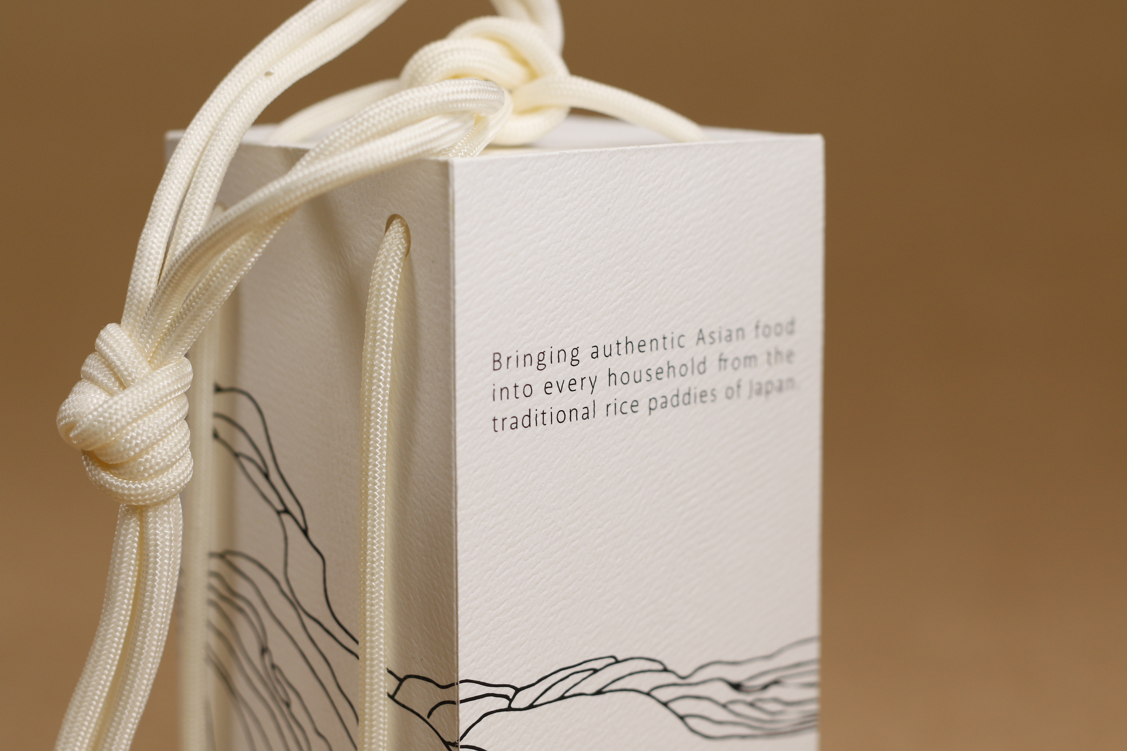
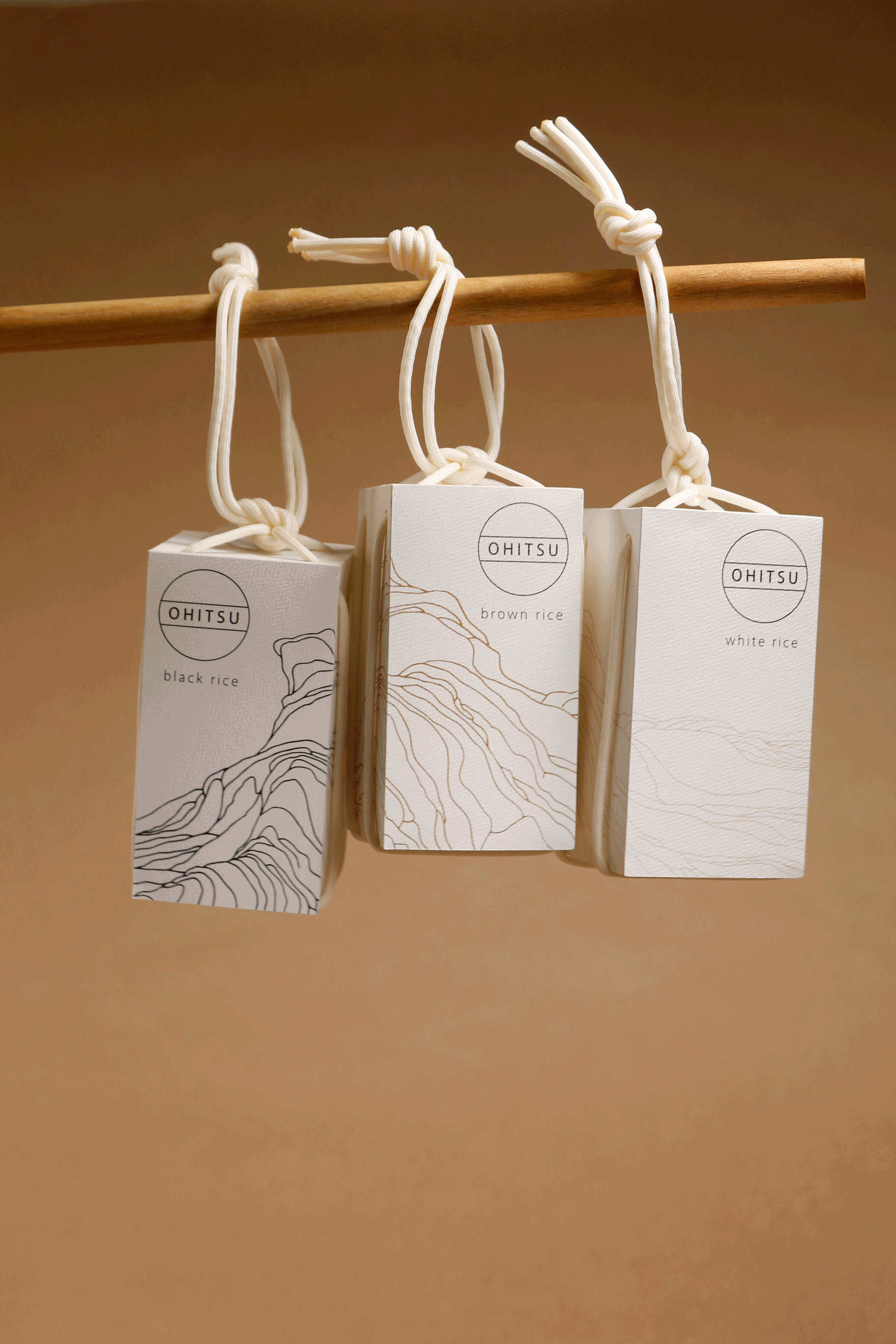
Ohitsu is an elegant Japanese rice brand that comes in all white, brown and black rice varieties. For the packaging and branding of this company, a simple and sleek design was created to reflect the Japanese design style. ‘Ohitsu’ is the Japanese word for the wooden container cooked rice is transferred into. This was chosen as it mirrored the packaging’s purpose to hold rice, with the logo being circular to represent the wooden box and the two lines to depict the handles. The design and simple style represents the origins of the rice and will give the shopper a reason to gravitate towards the product.
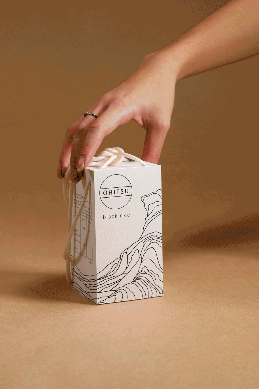
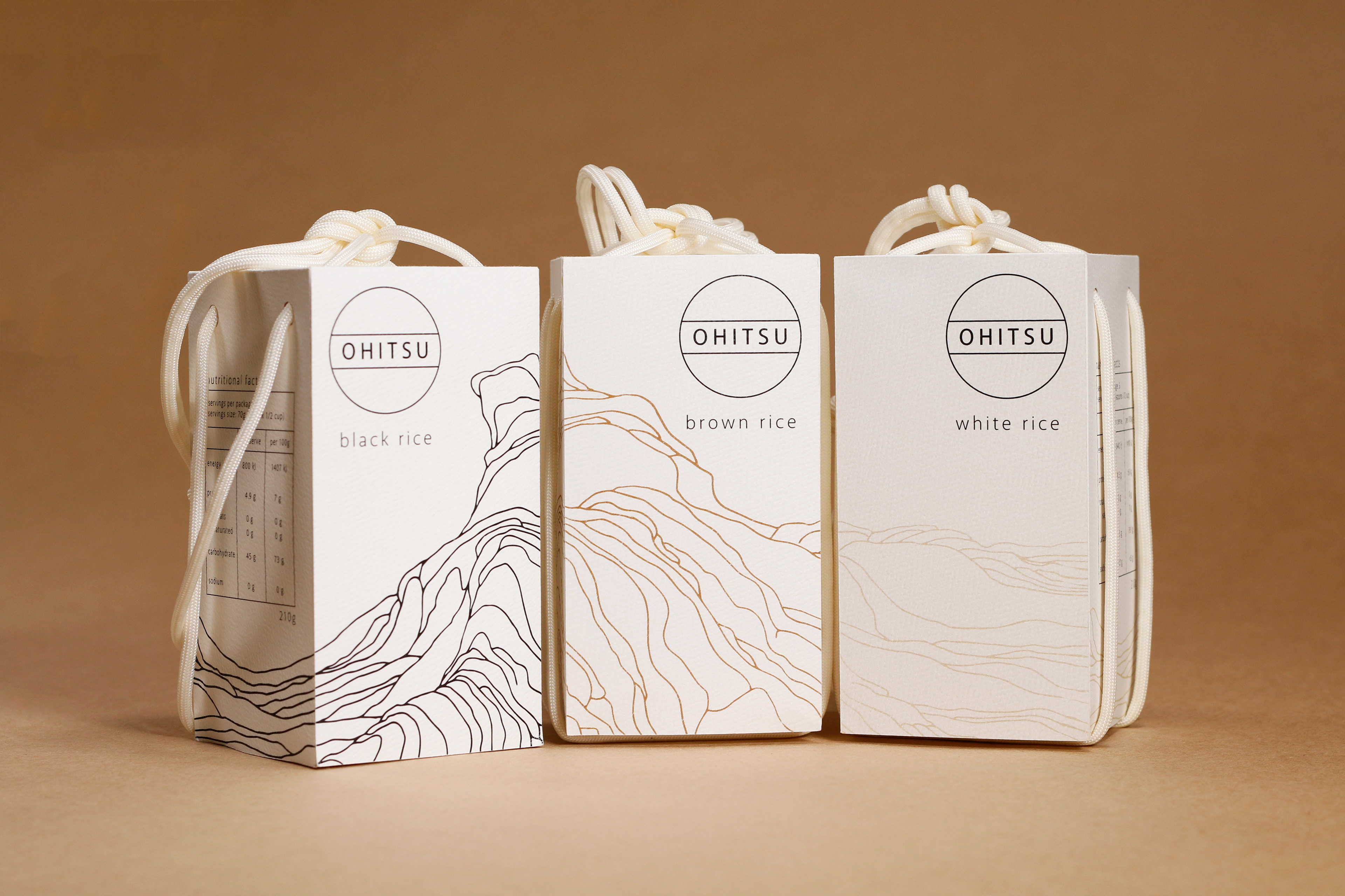
The simple line drawings illustrated a rice paddy field, wrapping around the entire box. As the range is intended to be sold in stores, each of the illustrations has been shifted so on the shelf, the illustration becomes a single image. The packaging and branding for Ohitsu rice is aimed at every individual. To differentiate between the different types of rice, a choice was made to change the illustration’s colour to further represent the type of rice: black for black rice, brown for brown rice, and a off yellow for white rice. This kept the design cohesive across the range for the brand to become identifiable. With a handle that wraps around the box, this rice packaging aims to be easily transportable and accessible to all.
Featured in DESIGN Magazine, Korea in 2018/04